
Accessibilité
System design
UX design
When Homegrade approached us, the goal was clear: to create a website combining elegant design, intuitive usability, and exemplary accessibility. Mission accomplished! The result: a carefully crafted site, where every detail is optimized for seamless and inclusive navigation.
Discover how we enhanced Homegrade’s content with a user experience that’s as aesthetically pleasing as it is effective.
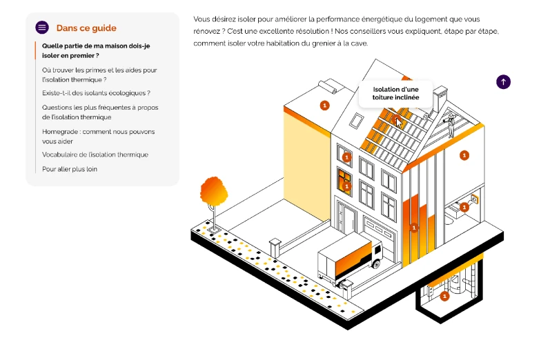
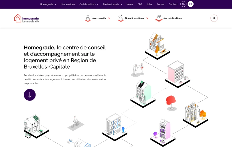
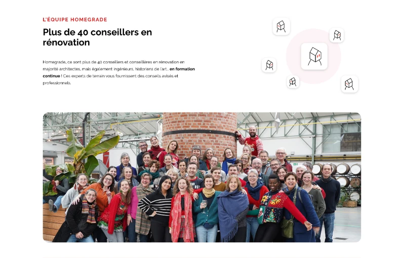
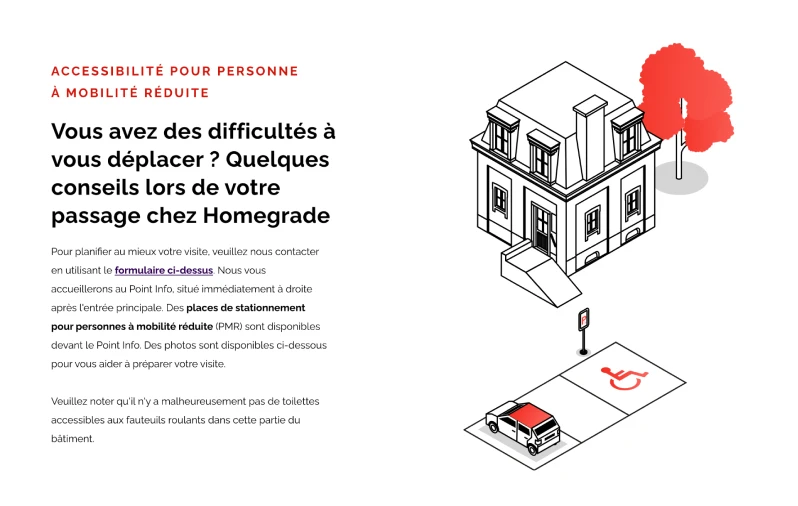
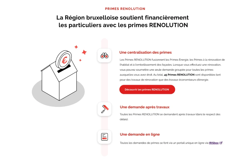
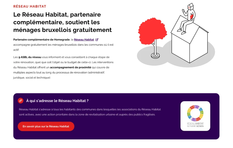
A refined design, fluid ergonomics and a user experience with all the trimmings
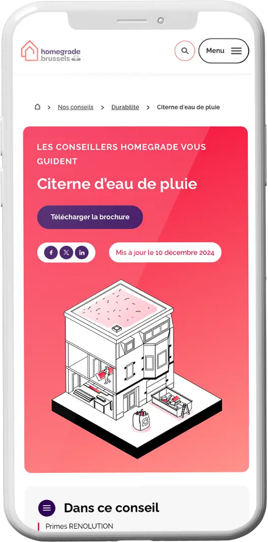
We’ve created a clear and intuitive interface, designed to seamlessly support each user. A design that exudes simplicity, seamless ergonomics, and a user experience that makes you want to come back.
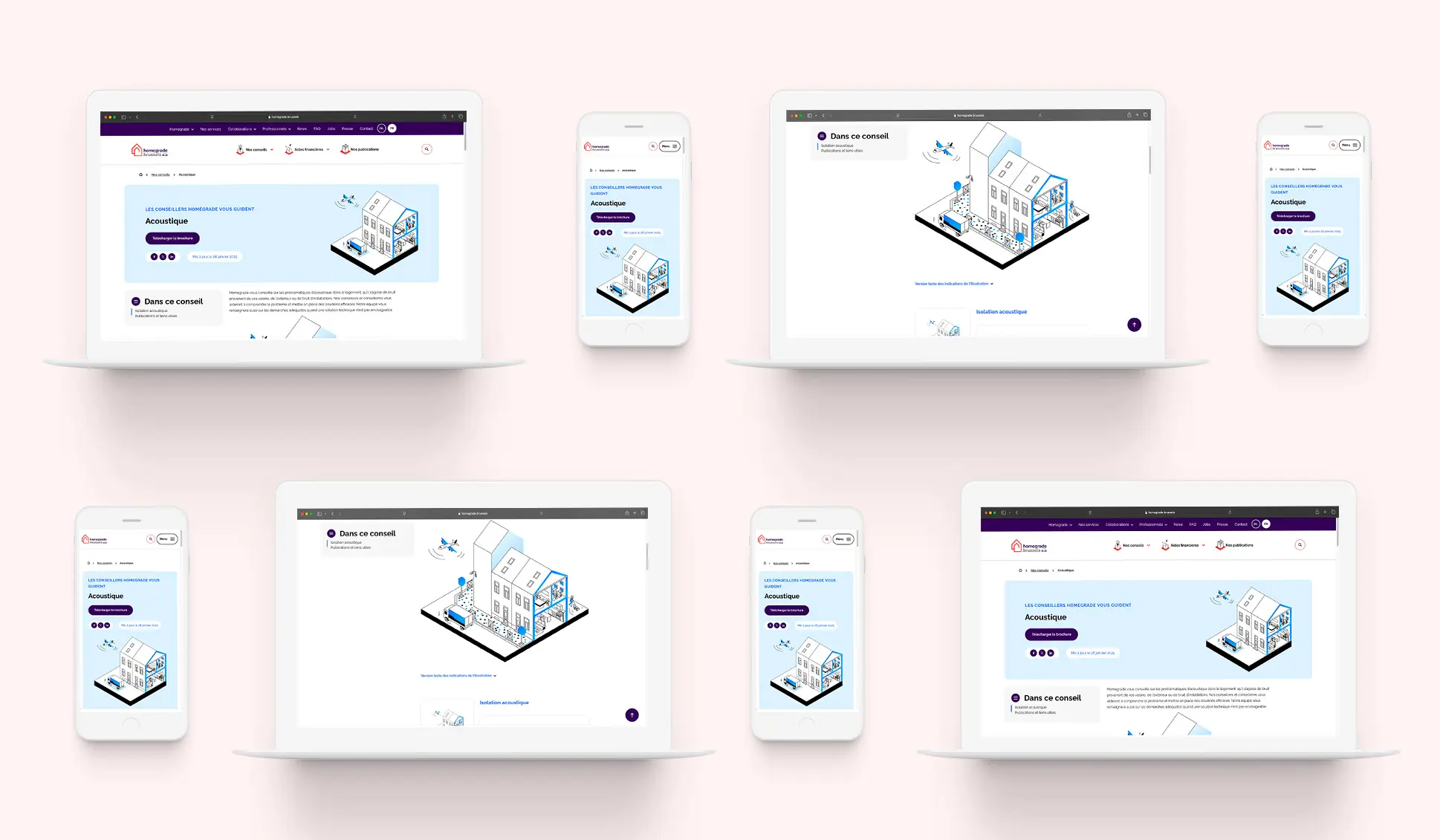
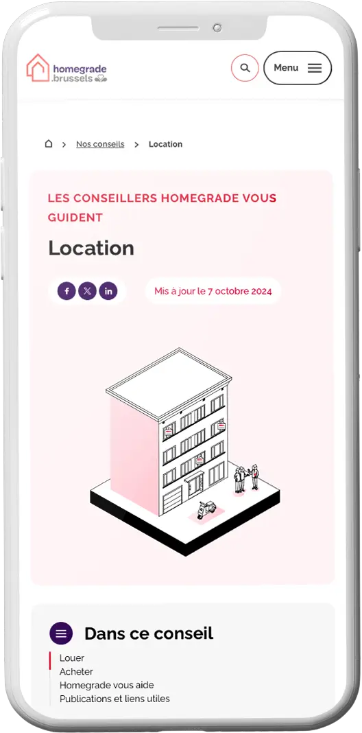
WCAG 2.1 accessibility rigorously applied
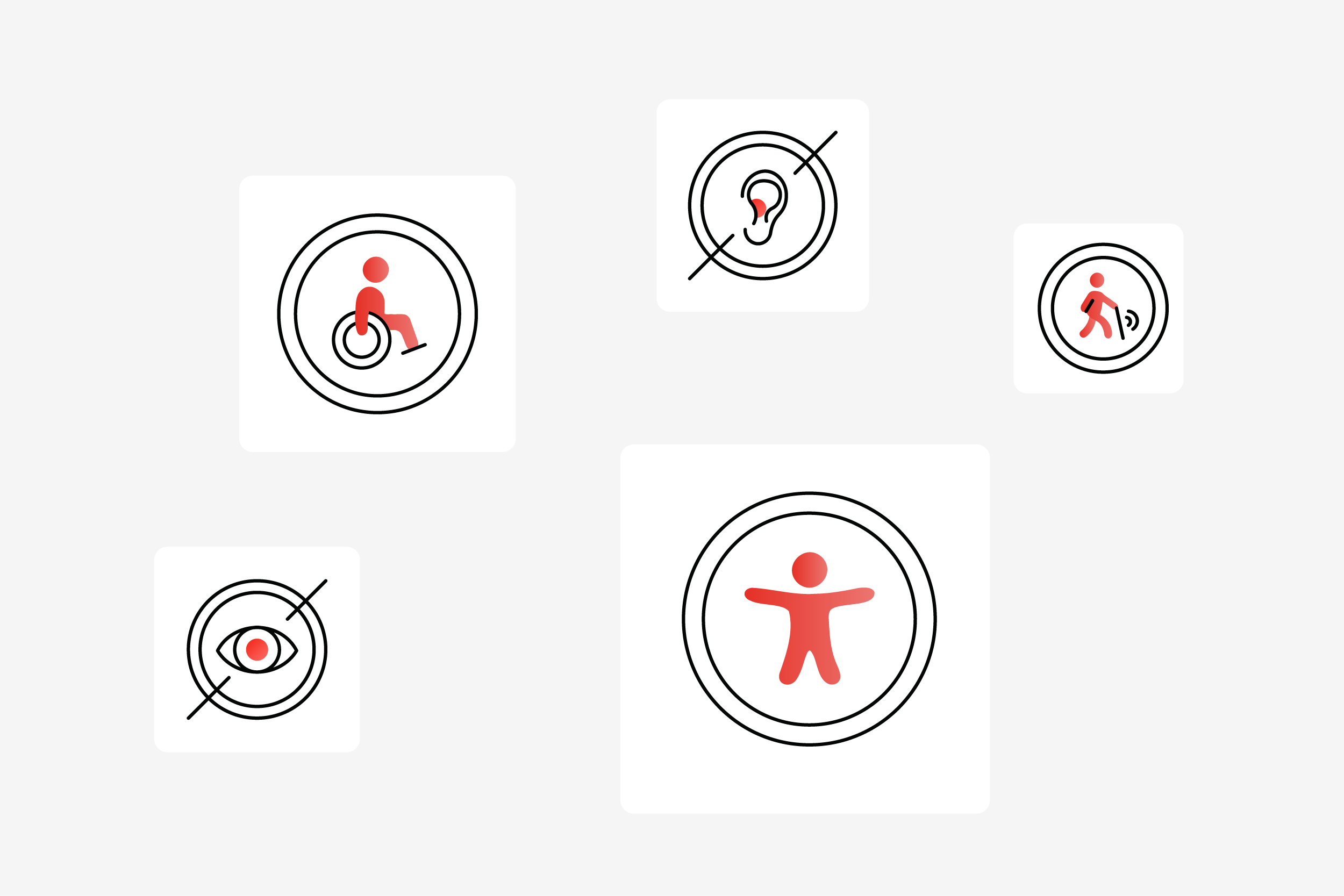
At Homegrade, accessibility is at the heart of the experience. We’ve integrated WCAG 2.1 AA standards to offer an inclusive and functional website.
Optimized contrasts, adjusted text sizes, and flawless code: we’ve thought of everything so everyone can navigate effortlessly.
No gimmicks, just an interface designed for everyone, with care and precision.
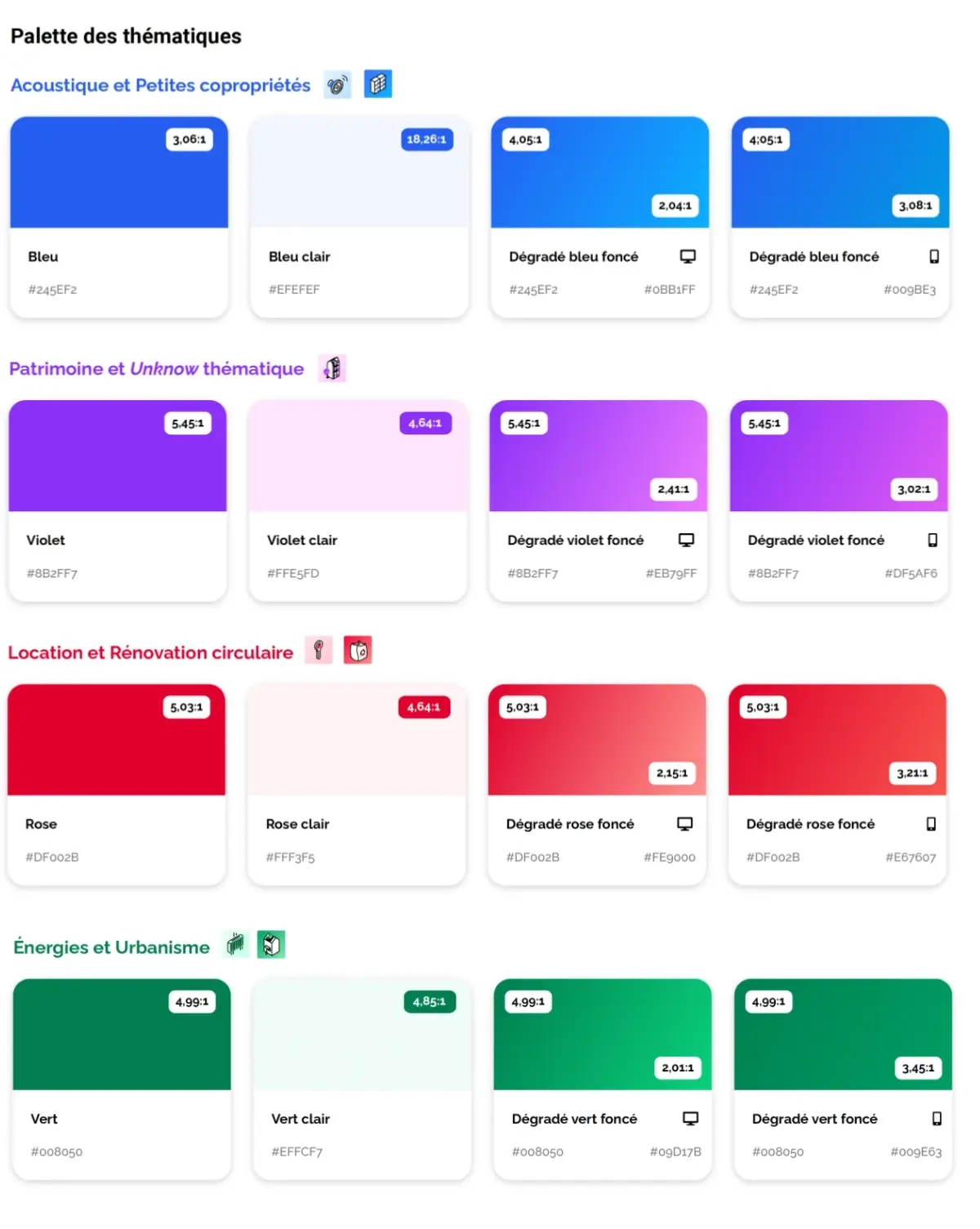
Contrasts and colors: tailor-made palettes for each theme
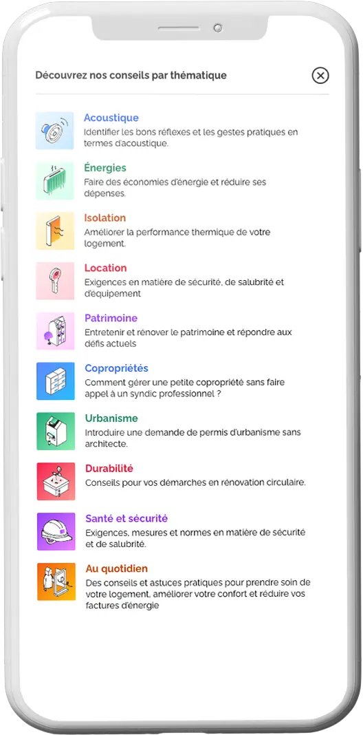
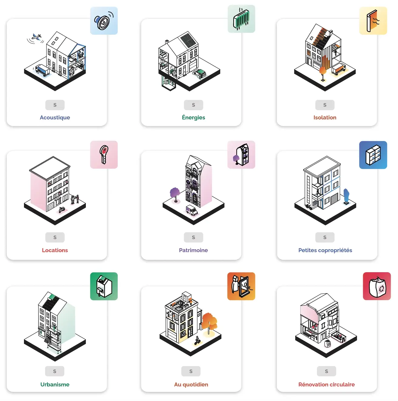
Ten themes, ten carefully crafted color palettes.
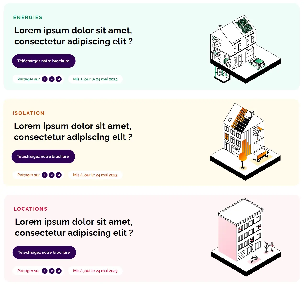
Our studio carefully considered each color choice to ensure readability and reflect Homegrade’s visual identity. On the advice pages as well as in the illustrations, all the colors and contrasts are calculated to combine accessibility and aesthetics.
This meticulous work brings out every detail without compromising the user experience.
Design system: elements that make all the difference
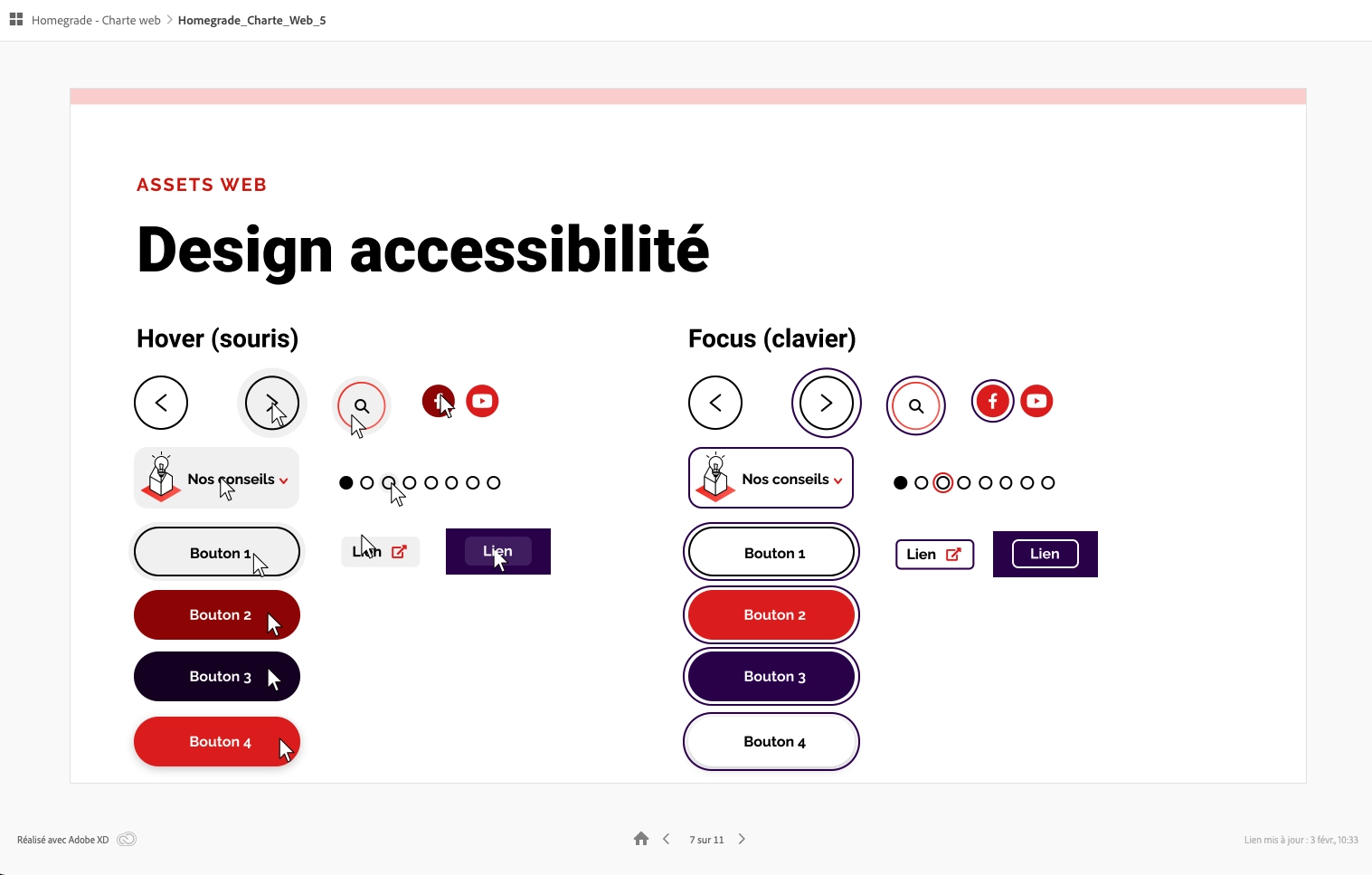
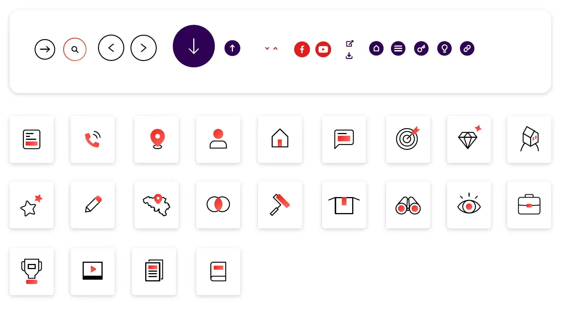
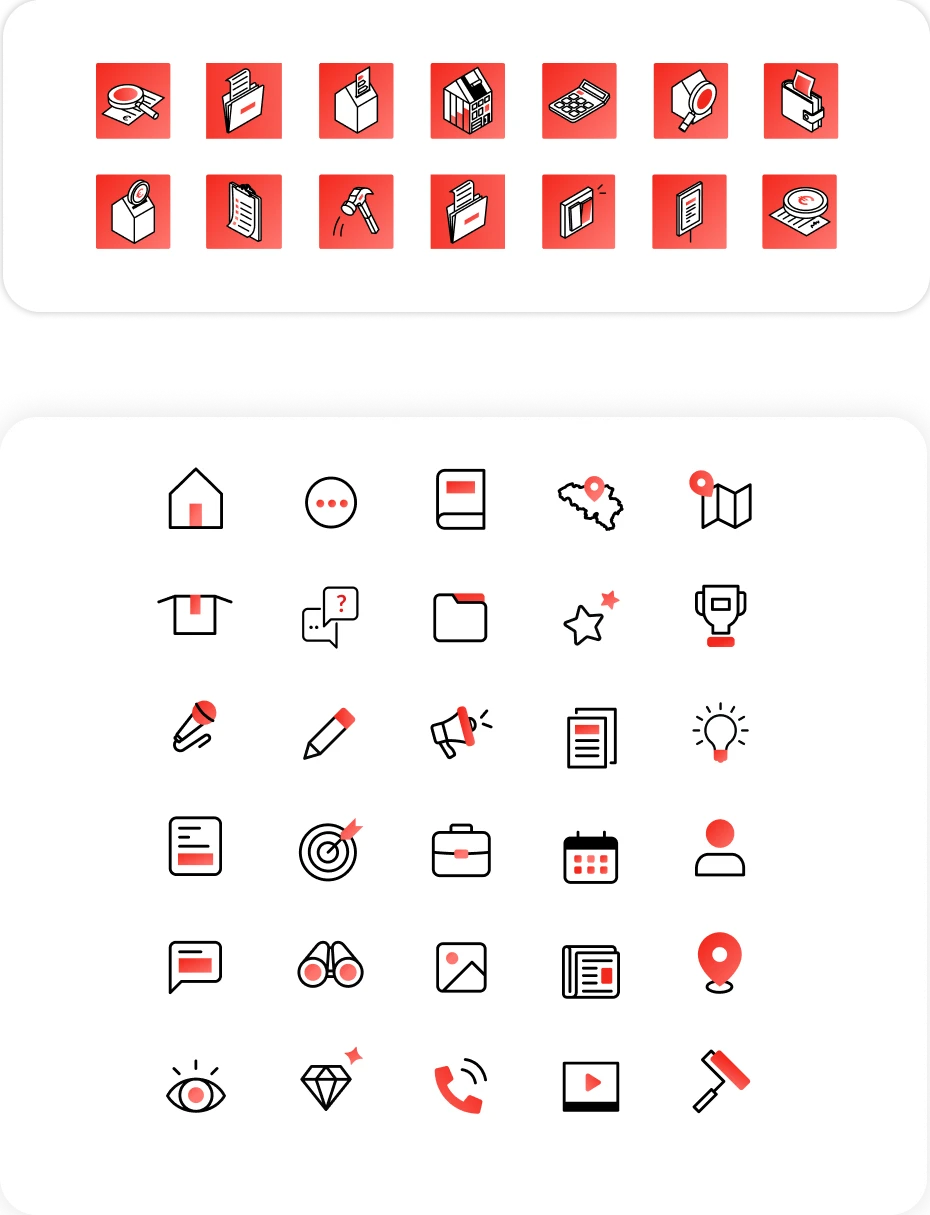
For Homegrade, we created a complete design system: buttons, icons, and navigation elements, all designed to integrate seamlessly and clearly.
No visual overload, but a structure that guides and reassures the user at every step. Every detail counts.
Illustrations and variations: visuals serving the content
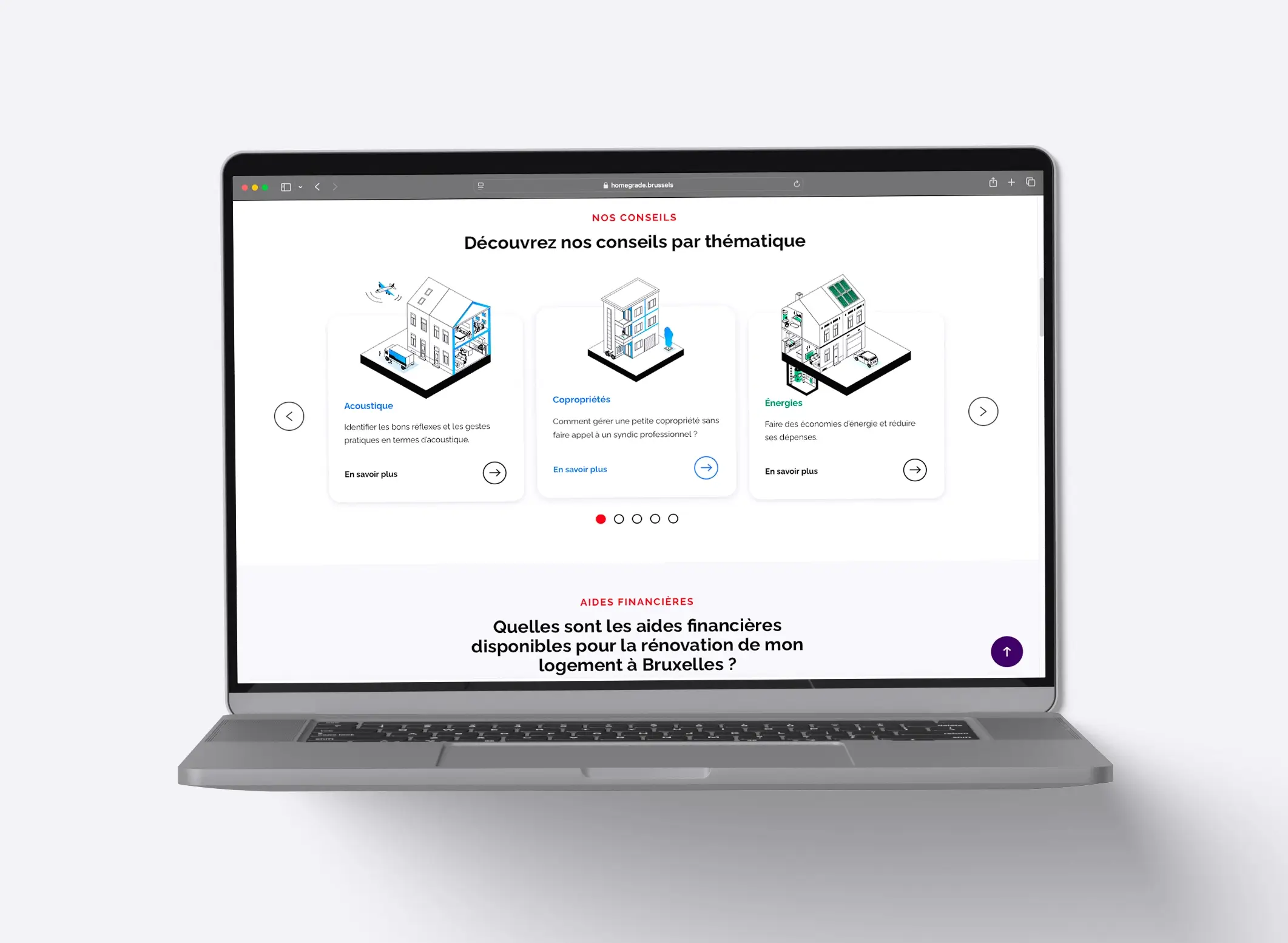
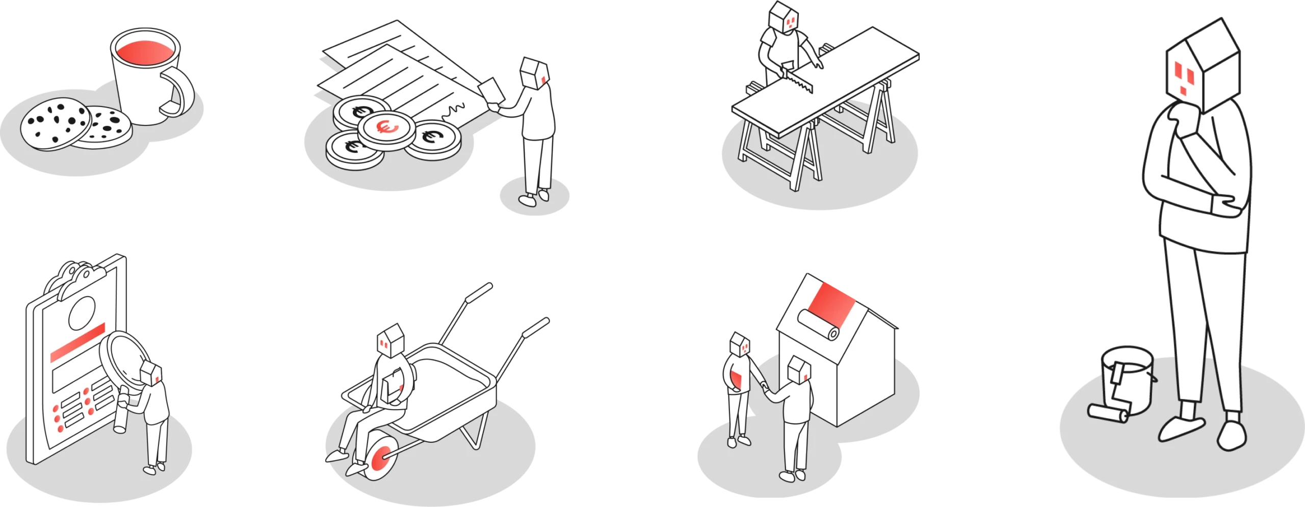
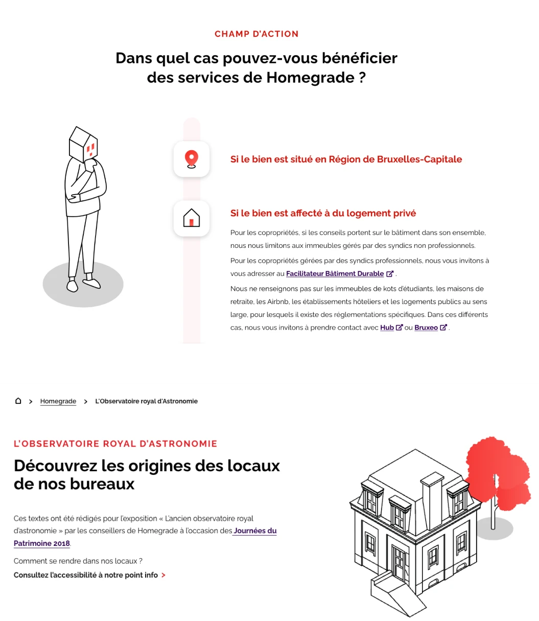
To enrich the site, we have imagined a tailor-made set of illustrations, available for each theme.
These visuals play an essential role: they clarify messages and make pages more engaging.
Sober, precise and coherent, they bring a warm touch while respecting Homegrade’s graphic codes.

Customized site administration for accessible, flexible and ergonomic rendering
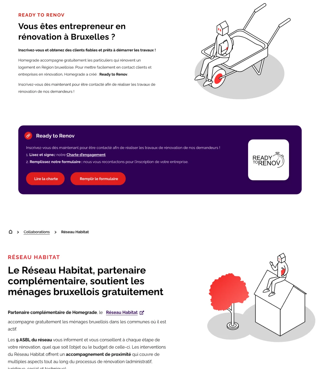
We developed fully customized Gutenberg blocks to structure and enrich the site’s content.
Diagrams, tables, visuals, and calls to action: each block was designed to be aesthetically pleasing, user-friendly, and compliant with accessibility standards.
An elegant and practical solution that allows Homegrade to manage its content with ease.

